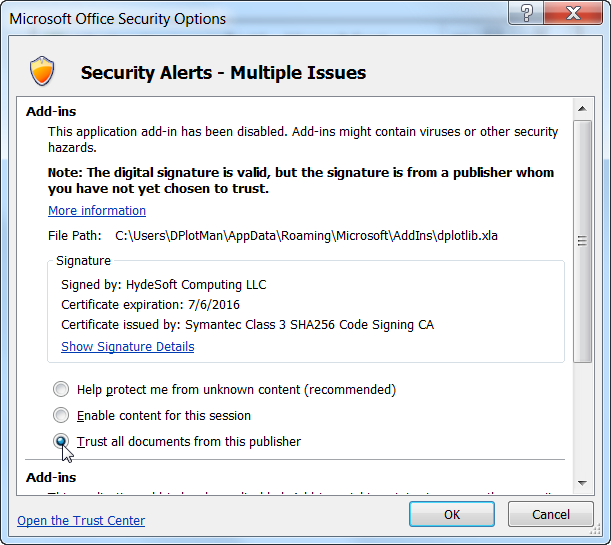
DPlot animations on YouTube

GeoLurking has posted several nifty animations of 4D scatter plots created by DPlot on YouTube which you can view here: http://www.youtube.com/user/GeoLurking. These might give you a few ideas for your own projects.

DPlot does not and most likely never will save AVI or other video formats, but there are several low cost screen-capture-to-video utilities out there that you might find useful. Camtasia has worked well for me. GeoLurking used AVS Video Tools.

Average Curve module

Starting with version 2.3.0.8, DPlot is distributed with an "Average Curve with Error Bars" modulethat produces a new document with amplitudes equal to the mean of all Y values within a user-specified interval in X, and error bars with extents equal to either:

  • the mean minus the extreme values,
  • the standard error for the points within the given interval, or
  • the standard deviation for the points within the given interval.
Here is an example from Dr. Aditya Savara:

When carbon monoxide encounters hydrogen covered palladium surfaces, the carbon monoxide can adsorb on the palladium surface and displace the hydrogen.  This process leads to the deactivation of hydrogen membranes, and also may be important in the production of pharmaceutical drugs by palladium catalysis.  In these experiments, carbon monoxide is introduced to a palladium crystal surface which has been precovered with hydrogen, H/Pd(111).  The infrared absorbance due to carbon monoxide is plotted as a function of time, and shows the buildup of carbon monoxide on the surface.  The discontinuity near 60 seconds is real, and is due to a change in the peak shape of the carbon monoxide infrared absorbance.  This data was measured in ultrahigh vacuum conditions at the Fritz-Haber-Institut in Berlin, using an effusive molecular beam for the carbon monoxide exposure, and infrared reflectance-absorbance spectroscopy.

The "Average Curve with Error Bars" command results in:

Maps and Background Images

From the start of the addition of background images to DPlot graphs, maps have been in mind. See here, for example.

This blog post isn't so much about announcing a new DPlot feature as it is about pointing out a public domain resource that you may not be aware of. NASA has produced a whole-earth image using Mercator projection that is just about perfect for DPlot. That image is available here. Example usage is shown at the bottom of the Geographic Maps page and repeated here:

A larger version of this image is shown here (~3.4Mb).

For this particular image, use Options>Extents/Intervals/Size and set the X/Y extents to +180 and +80, respectively. And of course you'll want to use Mercator Projection for your plot's scale. For a subset of this particular image you'll need to either specify the top/left coordinates within DPlot (easy for X, not so easy for Y) or crop the image within your favorite image editor.

DPlot at Watts Up With That?

I'm of course always happy to see DPlot mentioned on the web, but particularly when it is at a site as popular as Anthony Watts' Watts Up With That?

And no, this isn't an especially useful blog post and yes, I'm showing off. Sorry. Sort of :-)

Thermal Imaging

We'll end up adding a web page with user-submitted examples eventually, but these are too good to wait for. Paul has been using a FLUKE Ti-32 thermal imager to get IR readings from various objects. A patented feature of the Fluke camera is taking both visible and IR images simultaneously. Paul has graciously provided several images demonstrating this feature, which he went to the trouble of working with solely to show how well DPlot works with this setup... I have to like a user like that :-)

First, the IR image produced by the FLUKE Ti-32:

Paul used DPlot's "Bitmap to 3D" plugin to produce this contour plot:

(Note: This plugin is an optional component with both the licensed and trial versions of DPlot. If you do not see "Bitmap to 3D" on the "Select File Type" dialog under "Plugins", you need to re-run the setup program and ensure that you check the "Image file (BMP, GIF, etc.) to 3D Surface plot" option.)

He then added the photograph of the cup as a background:

Nifty, isn't it?

One more, this time without the photo and using DPlot's Both shades and lines setting, just because it is so darn pretty:

Here's another IR image converted to 3D, in this case of the counter top after removing the cup:

Thanks, Paul!

Background images

From the forums:

1) I need to plot pollutant concentration contours on an aerial image.

I have been evaluating dPlot and it can accept data from my dispersion modeling program. So dPlot does most of what I want except for the final step of applying a 'base map' so that the contours appear overlaid on a background aerial image.

Photoshop can combine two jpgs, but I would prefer it if there was a way to do it within dPlot so I don't need Photoshop.

and...

2) I am evaluating the capability of DPlot for my application. Overall, this is the great software with this price. I am going to buy it anyway. My application requires the background image(s) -- layer(s) of PCBA drawings, and foreground with a 3D Contour (rainbow colored) graphic shows the NFE (Near Field Emission) level. The foreground should be able to Alpha-blend with background image.

This can be done with another application (like Visio), but needs additional steps. It will be a great feature if this can be done in DPlot application.


Starting with version 2.2.8.8, either can be done. You can specify an image that will be drawn either in the foreground or background, with a specified transparency level and optionally a background color that will not be drawn. In addition, the alpha channel in 32-bit PNG files and the transparent color (if any) in 8-bit GIF or PNG images is respected.

1) The first example is a latitude-longitude recording of a Garmin GPS device overlaid on a Google Earth image:

2) The following image is a surface plot with an overlaid JPG schematic drawn with a transparency value of 50 (0=invisible, 255=opaque):

For more information see the Background Image topic in the online manual or the corresponding entry in the Help file.

Square root symbol in text

From support e-mail:

Q: I was wondering if there is any way in DPlot to put a square root in axis labels? What i am looking for is...say like..."sqrt(t)" but with the "real" square root symbol.

A: Yes there is, if you are willing to experiment just a bit. Select the Title/Axes command on the Text menu. (This also works with the legend and with point labels and text notations). Click within the text box where you want the square root symbol, then click the α button at the bottom of the dialog box:

Now select the left portion of the square root symbol in the next-to-last row, towards the right:

click the Select button, then OK.

For the horizontal bar, the best you can do is an overbar code. This draws a horizontal line above the character(s) that have this attribute. But there is no button on the Title/Axes (or any other) dialog for the overbar code, so you'll need to type it yourself:

Where this all becomes a trial-and-error process is that the overbar is not specifically designed to line up perfectly with the left end of the square root symbol. With some font sizes and weights it appears to be perfect, but with others... it isn't all that good. And the results will vary by output device. Generally if it looks good on the screen it will look good in saved bitmap images or printed out, but may or may not be aligned properly in metafiles. The alignment will vary with font face (Arial tends to work well), and smaller fonts (12-16 pt) tend to do better than larger fonts. Bold fonts definitely do better. But as mentioned at the outset, you'll have to experiment. Here's a 14-pt bold Arial stab at the problem:

Unfortunately this feature does not work at all with subscripts, superscripts, etc., as the overbar will be at varying heights above the baseline. Perhaps a future release will address this problem with a sqrt formatting code.

For a list of all formatting codes see the online Help topic for the Title/Axes command, or within DPlot click the Help button on the Title/Axes dialog box.

Calling Excel Add-In functions from a Macro

From support mail:

Q: I have done quite a bit with your Macro language. However, I have a question about your Excel Add-In. Do you know how I could call it from an Excel Macro? I tried recording a Macro and calling your Add-In, but it didn't show in the code when I was done.

A: Unfortunately Excel doesn't record calls to Add-In functions when recording a macro using keystrokes/button presses. But the fix is simple enough: Go through your normal steps in your macro recording just before you call XYXY or XYYY or whatever. Stop recording. For Excel 2007 or 2010 select the Developer tab, click Macros, select your macro, then click Edit. On Excel 2003 select Tools>Addins>Macros>select macro>Edit. At the end of the macro add a new line with

Call XYYY ' or whatever

And one final step: in the VBA window select Tools>References and check dplotlib.

If you are prompted for a password for the dplotlib entry on this screen, it is "dplot", without the quotation marks.

Edit: Starting with the Add-In distributed with v2.2.8.1 on March 9, 2010 you have access to several Add-In functions that were previously marked "private" and so were inaccessible to your macros. Namely DPlotGetActiveDocument, DPlot_Command, and DPlot_Request. How is this useful? If the default values for scaling, fonts, tick mark intervals, plot size, or whatever set by Add-In functions are not to your liking, you can control just about any aspect of the plot with a call to DPlot_Command, as in the following:

To call DPlot_Command or DPlot_Request you need the index of the currently active document (XYYY and other Add-In commands activate the plots that they create). That's where DPlotGetActiveDocument comes in. The DPlot_Command call in this case sets the tick mark interval to 365 (days, in this case) on the X axis and $1000 on the Y axis. For a rather lengthy list of all available DPlot_Command commands, see the Help file topic.

Important Edit:
When finished with calling any DPlot functions in your macro, if you have called DPlot_Command or DPlot_Request, you should disconnect from the currently active DDE conversation. Otherwise the plot will work as expected, but certain mouse operations (e.g. displaying coordinates while moving your mouse across the plot) will not work as expected, as DPlot will think there is still an active DDE conversation and responding to those actions is not appropriate. Disconnecting from a conversation can be accomplished simply with:

Call DPlot_Finish(doc)

Moving Average

Adapted from the Forums:

Q: I need to know what mathematical algorithm is used for the moving average calculations.

Normally, a moving average will require that the "end regions" of the graph not be included in the graph of the moving average, since, for example, a centered 11-day moving average can't provide data for the first 5 days and therefore can't be graphed. The same is true of the last 5 days in this example. I believe this problem is inherent in all moving average calculation varieties (though I'm open to being educated).

I bring it up because graphing the end-point regions of a moving average generates quite a bit of controversy in the climate sciences where I work because the end regions normally excluded in a moving average have to be filled in based on some sort of (often unscientific) assumption--even a simple "continue the trend" assumption.

A: For versions 2.2.7.0 and earlier, the output of the Moving Average plugin is an average of the last N points, where N is the interval chosen. This is identical to the Moving Average function of Excel's Analysis ToolPak, with the exception that Excel gives "#N/A" for the first N-1 points, while the DPlot plugin gives the average of i points for i<N.

The new version of the Moving Average plugin includes three forms, two of them new: 1) Prior Moving Average (identical to the only previous option), 2) Central Moving Average (more like what you're talking about, with point i equal to the average of points i-(N-1)/2 through i+(N-1)/2, and 3) Cumulative Moving Average, which is the average of all points up to and including the i'th point.

In addition, the new plugin allows you to include (or not) points at the tails of your data. If Include tails is checked, then as before the i'th point for i<N is the average of the first i points for a Prior Moving Average. Similarly, for a Central Moving Average and i<(N+1)/2 or greater than NP-(N-1)/2 (where NP is the number of points in the input), the output is the average of the sampled input points. If Include tails is not checked, then the output will only include points for which i>N for a Prior Moving Average, or i>(N-1)/2 and i<NP-(N-1)/2 for a Central Moving Average.

The new input dialog for the Moving Average plugin (licensed version only):

Which method is appropriate for your use is dependent on what you are measuring. The Prior Moving Average is a well-established standard but for data that tends to increase or decrease over time, introduces a lag in the output: for a steadily increasing record the output will tend to be equal to the input N/2 measurements ago. The Central Moving Average eliminates this lag but may not be appropriate for your use if the current prediction should not be influenced by future data. The Cumulative Moving Average is mostly useful for data that doesn't increase/decrease monotonically over time and for which early data is significant for the present.

The new plugin is included with the 2.2.7.3 release of DPlot. Licensed users who are not on the update mailing list can get this version by selecting the Check for Updates command on the Help menu.

Example (with Include tails checked in all cases):

Help! DPlot's Help doesn't work!

In case you missed the recent addition to the FAQ and are having trouble with DPlot's Help:

When selecting Help>Contents in DPlot if you see a screen like this:

...then you almost certainly have DPlot installed on a network server and are running DPlot from a client system. Although the program will run fine in this configuration, the Help file will not. Unfortunately this is a Windows security "feature" introduced with a security patch for Windows XP, also affecting all Vista versions. If you are certain that you will not be viewing any "untrusted" CHM Help files then the good folks at EC Software have provided a fix. Otherwise, your best bet is to install DPlot to all client machines rather than running from a server.

-->