June 2009 Archives

Offsetting a curve

From support e-mail:

Q: I have created a log-prob curve and have fitted an equation to it that fits very nicely. Now I would like to create a parallel curve through another known data point How would I do this?

A: Nothing to it. You want your new curve to have the same shape (on this scale) as the original curve but offset by some value. So in your case the logarithms of the Y values in the new curve should all be proportional to the logarithms of the Y values in the original curve. First copy your curve fit to the Clipboard using Edit>Copy>Data Values and then paste using Edit>Paste so that you have a copy of that curve and can preserve the original.

It's good in your case that you have a known offset between two points with the same X values. Otherwise this would take a smidgen more work. But basically, you want the same shape curve to pass through the point X=4%, Y=553, where the original passes through X=4%, Y=2697. So the new curve should be something like Y'=10^(log10Y + log10553 - log102697. Remembering a bit of high school algebra, this reduces to Y'=Y*553/2697 (though either form will work). Use the Operate on Y command on the Edit menu on your pasted curve with Y=Y*553/2697 to get:

... which mimics the original curve fit with an offset in Y.

Finding 0.2% offset strain

This one is intended mostly for folks who break things. Specifically, structural engineers who pull on steel (or other ductile metal) bars until they fail. From Wikipedia:

Ductile metals do not have a well defined yield point. The yield strength is typically defined by the "0.2% offset strain". The yield strength at 0.2% offset is determined by finding the intersection of the stress-strain curve with a line parallel to the initial slope of the curve and which intercepts the abscissa at 0.2%.

The question, then, is "Is there an easy way to determine the 0.2% offset strain line, without a calculator handy?" Yes, there is. Shown below is a typical stress-strain curve, in this case for a rolled steel bar.

The first step is to find the slope of the elastic portion of the stress-strain curve. You can do that very easily with the Distance from... command on the Info menu. Ensure that Snap cursor to nearest data point is checked, then drag the mouse from a point near the origin along the initial (hopefully linear) slope:

To avoid retyping (and transcription errors), drag your mouse over the "slope" value, right-click and select "Copy". Now select the Y=f(X) command on the Generate menu. The equation we want is simply (in this case) "21.6569856057*(x-2000)" (2000 microinches/inch = 0.2% strain). For the from X value use 2000 (or any smaller value); for to X use a strain value large enough that the line will be certain to cross the stress-strain curve. You can then zoom in if you overshoot the curve by a lot. The with interval dX entry isn't critical, since you'll be generating a straight line.

Finally, select Find Intersections... on the Info menu. (If this command is disabled you likely need to sort the data points with the Sort command on the Edit menu.) Check the Insert data points... and Add labels at intersections boxes, and you get:

... indicating a yield stress of ~70.5ksi at a strain of ~0.005.

Thanks much to Stephen Rowell for his input on this one.

Ternary plot options for rocks

From support e-mail:

Q: I work with mineralogical data, some of which is used for rock classification. Is it possible to define field classification boundaries, other than those in the soil plot, so that rock classifications can be plotted? I am using the standard IUGS rock classification diagrams for felsic, mafic and ultramafic rocks which are based on three minerals each. I have tried plotting field boundary coordinates in X-Y space and then selecting triangle plot, but the line disappears.

A: In general you can plot any sort of boundaries and/or labels you want with a ternary plot (aka triangle plot, depending on what world you work in), and your "but the line disappears" is easily explained. But more on that below. First, yes you can plot mafic and ultramafic rock classifications starting with version 2.2.6.

If the plot you have on the screen is not a triangle plot, first right-click on the graph and select Triangle Plot (or, equivalently, click on the Options menu, then Linear/Log Scaling, then Triangle Plot). Then right-click again on the plot and select Triangle Plot Options (again, the same option is available on the Options menu). You'll be presented (with version 2.2.6 or later) with this dialog box:

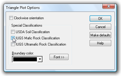
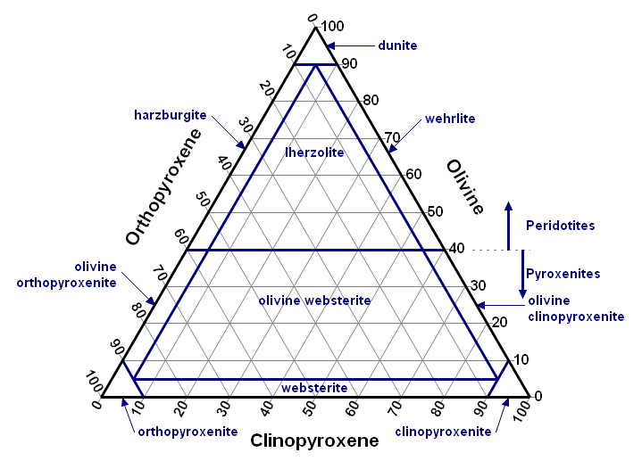
Select the appropriate options and click OK. For an ultramafic scale and blue boundary lines, you should now see something that looks a bit like this (minus your data):

As to the more general question, you can create whatever boundaries and labels you want, save those to a DPlot file, then later open that file and import and/or add that data to your file. Your "but the line disappears" comment is due to a default setting with regard to triangle plots. Take a look at the General command on the Options menu. Most likely the Always force symbols on/lines off for triangle plots option is checked. That option only applies to new data; you can either uncheck that option or later select the Symbol/Line Styles command on the Options menu to use a line style other than "None".

An example is always nice, so here is an example:

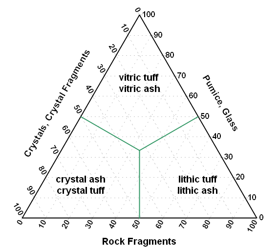
You want to show the boundaries for tuffs and ashes from R. Schmid's Descriptive nomenclature and classification of pyroclastic deposits and fragments: Recommendations of the International Union of Geological Sciences Subcommission on the Systematics of Igneous Rocks.. Yes, I know you don't really want that, but follow along anyway. The boundaries between the 3 regions will be created with normal DPlot "curves". The X,Y endpoints are:

(50,0) - (33.333333,33.333333),
(0,50) - (33.333333,33.333333), and
(50,50) - (33.333333,33.333333)
You can easily enter these points using the Edit Data command on the Edit menu.

Labels for the various regions are added with the Add/Edit Note command on the Text menu (or by clicking the Note button on the toolbar). You can either drag the notes to the desired location, or specify their location in terms of data space initially (no dragging required). The anchor point in data space for the notations shown below, with the justification set to Center and Middle in all cases, is:

vitric tuff\nvitric ash: 16.67, 66.67
crystal ash\ncrystal tuff: 16.67, 16.67
lithic tuff\nlithic ash: 66.67, 16.67

Once done your plot should resemble something like this:

Once this graph is created you can add your own data with the Edit Data command on the Edit menu or, if your data exists in a file, with the Append command on the File menu (as opposed to the Open command).

The DPlot file for this picture is available here (right-click and select Save As).

About this Archive

This page is an archive of entries from June 2009 listed from newest to oldest.

May 2009 is the previous archive.

July 2009 is the next archive.

Find recent content on the main index or look in the archives to find all content.

Categories

Pages

Powered by Movable Type 4.25