Graph Software for Scientists and Engineers
Graph Software for Scientists and Engineers | ||
Geographic MapsMaps are useful for showing geographic relationships that are not immediately apparent from tabular data. For example, the plot below (repeated from the Features page, shows the distribution of earthquakes in 1999 through early 2001. 
This page will walk through the steps needed to reproduce the world map shown in the example above. For other boundaries see below. We've chosen the world because this particular dataset contains a couple of hurdles to overcome that you might also encounter with other maps. To recreate this example you will need the licensed version of DPlot rather than the trial version, because it includes support for ArcView shapefiles while the trial version does not. (NOTE: If you have a suitable background image with known latitude and longitude extents and Mercator projection scaling, see below.) Shapefiles for various countries and the world are available from the DIVA GIS web site and many other sources. From the DIVA GIS site get the world shapefile. This is a zip file containing 3 files. Download this file to your hard disk and extract the files world_adm0.shp and world_adm0.shx (the dbf file is not used by DPlot). In DPlot select the Open command on the File menu. On the Select File Type dialog select Plugins, then scroll through the list to ArcView Shapefiles:
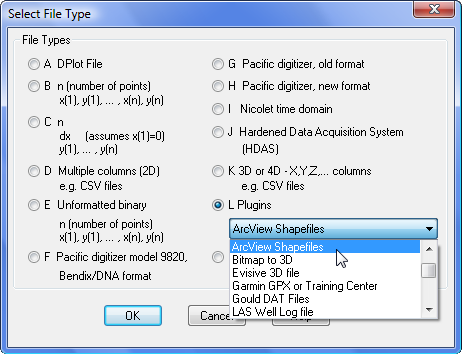
... then click OK. Navigate to the folder where you saved the world_adm0 files and select world_adm0.shp. After clicking OK you'll get a plot that looks something like this: 
The first thing you will likely notice about the plot is that the longitudinal axis starts at 160° rather than −180°. That's simply because a small error in the file results in one data point having a longitude of −180.0002 rather than the intended −180. You can either force the extents to be +180 degrees with the Extents/Intervals/Size command on the Options menu, or correct the error with the Operate on X command on the Edit menu. Using Operate on X with X=max(−180,X) will give the expected extents.
You can draw intermediate tick marks by selecting Extents/Intervals/Size on the Options menu and entering the number of intermediate intervals in the Minor grid/tick divisions boxes. With 5 intervals on X and Y your plot should resemble the following: 
To fill in the landmasses, select the Fill Between Curves command on the Options menu. In the "1st Curve" box select "1: Curve #1", the only curve in the list. This is our boundary "curve". Leave the "2nd Curve" box set to "None". The effect will be to fill in the area formed by closing curve 1. At first glance this hardly seems correct, as the continental boundaries are obviously not all connected. It works as expected because the plugin automatically inserts nonsense points with latitude = 100° between landmasses and turns on DPlot's Amplitude Limits feature with the limits set to +85°. When filling curves DPlot breaks the curve up into segments bounded by points inside the range specified with Amplitude Limits. Set the color for the fill by clicking on the color control. In our example we've used r,g,b=51,153,102. The result: 
The result: 
...and click the color control for "Plot Background". In the example below we've used r,g,b=131,159,243. The finished map: 
If you haven't followed along with this exercise you can download the DPlot file of this plot. (999 Kb). To display additional data on this background, if the data resides in a file be sure to use the Append command on the File menu rather than Open, since Open will always create a new document. To recreate the plot of earthquake magnitudes shown in the example, download and install the Earthquake Study Kit. The actual data file will be located in the DATA folder below the folder where you install SiMPLE (default=c:\SiMPLE\Internet). With the world map created above open, select the Append command on the File menu, select file type "D Multiple columns (2D)" and click OK. On the Open dialog, navigate to the DATA folder below SiMPLE and select the file QUAKES. Be sure to check the "Pick columns to plot" box on the Open dialog, then click "Open". On the Specify Columns to Plot dialog, select column 3 (Lon) for "Use column __ for X axis" and check columns 2 (Lat) and 5 (Mag) under "Use these columns for Y"; all other columns should be unchecked. Click OK. Initially you'll get a horrible mess: 
That's because DPlot is plotting both latitude vs. longitude and magnitude vs. longitude as separate curves. Plus, there is no particular ordering to the latitude points, so the "curve" jumps all over the plot. What we want is symbols drawn at each latitude/longitude pair, with the size of the symbol proportional to the earthquake magnitude at that location. A bubble plot, in other words. Select Bubble plot on the Options menu. Under "Which curve?" select "2: Lat". Under "Bubble amplitudes from" select "3: Mag". All other settings are a matter of your own preference; here are the settings used in the example at the top of the page:

If you'd like to plot only a subset of the data, for example only earthquakes with magnitudes between 6 and 8 rather than 3 and 8, select "Specify limits" and "Don't draw bubble" under "If value is outside limits". Using those settings yields this plot: 
...which tends to make southern California look rock-solid compared to southeast Asia. The only other thing a bit unusual about the example plot is the legend placement. Generally the legend will be placed within the bounding rectangle of an XY plot, usually in the upper left corner. For this example the plot will look better with the legend placed outside the plot. To get exact placement of the legend, double-click on it or select the Legend/Labels command on the Text menu and enter X,Y=0.5,0 for the location, with "Center" and "Bottom" selected for the anchor point. Legend placement coordinates are a ratio of the plot size: 0,0 is in the top left corner of the plot; 1,1 is in the lower right corner. So 0.5,0 will place the legend with the anchor point at the center horizontally, at the top of the plot. When the legend is placed outside the confines of the plot, though, you'll need to use a bit of care with title lines and/or axis labels, so that those labels don't overlap the legend. You can add blank lines to a title or axis label with the character sequence \n, which is what we've done in the example. For C programmers, that is the actual character sequence \n, not a line feed character. The example graph shown at the top of the page is available as a zip file. (1235 Kb)
Along with the DIVA web site mentioned above, the US Census Bureau has ArcView Shapefile files for US states and counties. A map of the continental United States in compressed DPlot format is available here (~1 Mb). This graph was built from
the Census Bureau files mentioned above, and includes the 48 continental states plus the District of Columbia, stored in alphabetical order. Each state is a
separate "curve" with the (hidden) legend entry corresponding to the state name. (To "unhide" the legend select Text>Legend/Labels and
uncheck "Hide legend".) This file might be useful for plotting state-by-state differences in voting, population density, crime statistics,
etc. In particular this map and others like it may be useful for programmers. For example the DPlot macro/DDE command:

Using Background ImagesAlternative to importing an ArcView shapefile or other map file, if you have a suitable background image with (this is the trick) known latitude and longitude extents that uses either linear scaling or the Mercator projection (both Google Earth and Google Maps use Mercator projection), you can use that image as the background with the Background Image command on the Options menu. The example below uses a public domain image originally produced by NASA's Earth Observatory "Blue Marble" series. 
Questions? Let us know. |
RUNS ON
Windows 10, Windows 8, Windows 7, 2008, Vista, XP, NT, ME, 2003, 2000, Windows 98, 95 |
|||||||||||||||||||||||


