|
|
Graphing Inequalities
Rather than a line or a curve, the solution set for an inequality involving X and Y fills an area on the
XY plane. An equation defines the boundary or edge of the set. Although DPlot will not directly solve for and
plot inequalities, you can easily do so yourself in a few steps. First rearrange the inequality (if necessary)
in the form Y < (or <, >, >) f(X). Use the Y=f(X) command on the Generate menu to plot the
boundary of the inequality. If the inequality is < or > rather than < or >, the usual
practice is to plot this boundary using a dashed line. To change the line type of the boundary line or curve,
right click anywhere on the boundary and select "Line style". Finally, use the Fill Between Curves
command on the Options menu to fill in the area above or below the boundary, depending on whether the
inequality is > (above the boundary) or < (below the boundary).
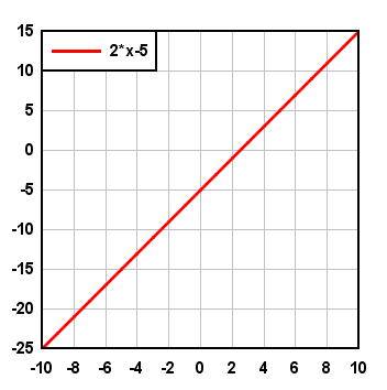
Example 1: Graph the solution to y > 2x-5.
- Select Y=f(X) on the Generate menu. In the "Y=" box type 2*x-5. (Note the multiplication sign;
you must include all operators in your equation; in this case DPlot would not recognize 2x as 2*x.
Enter a start and end value for X. In this example we've used -10 < X < 10 with an interval
of 1. (The interval is not important since we are only graphing a line; two points are sufficient.) That operation
produces a graph similar to:
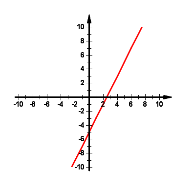
- The Y=f(X) command will automatically produce a legend as shown in the graph above. If you do not want this
legend, right click anywhere on the legend and select "Hide Legend".
- If you would like the physical distance between X and Y units to be the same, select the
Extents/Intervals/Size command on the Options menu, check "Specify extents" and enter the extents
you want, then check "Specify size" and enter width and height values that have the same proportions
as the graph extents. In this example extents of +10 for both X and Y and width=height works well.
- You can change the appearance of the coordinate axes by clicking any of the Grid/Box buttons on the toolbar
or selecting the Grid Lines or Box command on the Options menu. And if you want the coordinate axes to
pass through X=0 and Y=0 rather than being placed on the left and bottom sides of the graph, check the
Axes at 0 option under Grid Lines or Box. The above changes result in:
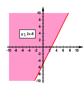
- Select Fill Between Curves on the Options menu. Although this command is primarily used to fill in areas
between two different curves, it can also be used to fill the region between a curve or line and some X or Y reference
line. In the "1st Curve" list select "2*x-5". For the "2nd Curve" entry, since our inequality
is > we are interested in Y values GREATER THAN the line we just graphed. So we select "Top" from the
list. This will result in the area between the top of the graph and the line y=2*x-5 being filled. Select the fill style and
color you want to use, then click OK.
- Finally, you'll want to add a label to the graph describing the inequality. You could place the label in the graph
title (Title/Axes command on the Text menu). In this example we'll add the label using a notation.
Select Add/Edit Note on the Text menu, or click the Note button on the toolbar. Click the "Add note"
button. In the "Note" box, type "y > 2x-5" then select the > character and click the
underline button. Check the "Frame note" and "Opaque" boxes, then click OK. You can drag the
note to the desired location with your mouse. The finished product:
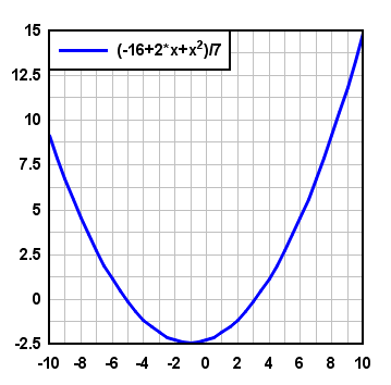
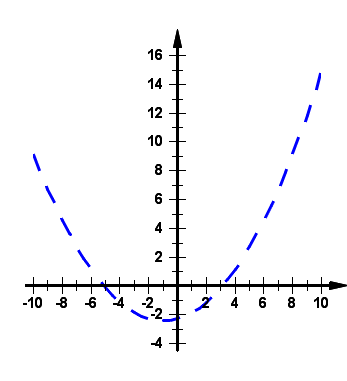
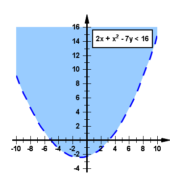
Example 2: Graph the solution to 2x + x2 - 7y < 16.
- This example requires an extra step since we first need the equation expressed as y as some function of x. First solve for y:
2x + x2 - 7y < 16
-7y < 16 - 2x - x2
y > (-16 + 2x + x2)/7
Note the change from < to > in the last step. Don't forget to change the inequality if you change signs.
- Proceed as in the previous example with the Y=f(X) command, this time with Y=(-16+2*x+x^2)/7. Note that in this example,
since our equation is a curve rather than a straight line, the spacing between points using Y=f(X) is now important.
In this case any spacing smaller than 0.5 or so (which we've used here) will result in a reasonably smooth curve:
- In this example the expression is "y greater than", not "y greater than or equal to" For strict
inequalities the usual practice is to show the boundary as a dashed or dotted line rather than a solid line. To change line styles right
click anywhere on the curve and select "Line style". After this and other formatting changes similar to the first example,
your graph will resemble this:
- Once again, use the Fill Between Curves command on the Options menu to fill the region above the curve (above
because Y > f(X)).
In this example we used an interval in X of 0.5, which, again, results in a reasonably smooth curve. For high-order polynomials
a smaller interval may be needed. For more information on the Y=f(X) command take a look at the
online manual.
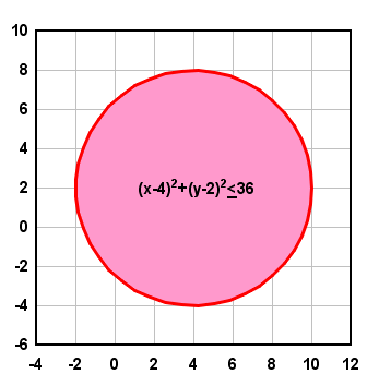
Example 3: Graph the solution to (x-4)2 + (y-2)2 < 36.
You might recognize this equation as a circle of radius 6 centered at (4,2). You could rearrange this inequality as:
y < 2 + sqrt(36 - (x-4)2)
... but there's a problem: The Y=f(X) command will only generate data points for which there is one unique Y value for every X.
So even though the above is the correct equation for our circle, use of this equation with Y=f(X) will only result in a
semicircle (the positive Y half). There are two ways to get around this limitation:
- We can use Y=f(X) and plot both the top and bottom halves of the circle, then fill between those two semicircles.
In this case our two equations are:
y < 2 + sqrt(36 - (x-4)2)
and
y > 2 - sqrt(36 - (x-4)2)
in both cases with X varying from -2 to 10. Then use Fill Between Curves to fill the area between the top and bottom semicircles.
One weakness of this approach is that the data points are evenly spaced in X. So the areas near the left and right extremities of
the semicircles will have fewer points than the areas near the top and bottom, resulting in an angular appearance unless you use
a small interval between points.
- A better approach requiring just a bit of trigonometry is to use the X=f(T), Y=g(T)
command. With T varying from 0 to 360 degrees, X=R*cos(T), Y=R*sin(T) defines a circle of radius R. In our case we use
X=6*cos(T)+4
Y=6*sin(T)+2
with T varying from 0 to 360 degrees.
After producing the circle we again select the Fill Between Curves command. This time, however, we select our circle as
the first curve and "None" for the 2nd curve. When "None" is used for the 2nd curve, DPlot fills the area formed by
closing the 1st curve:
If you would like to graph the solution to a set of two or more inequalities at once, see the
Graphing Systems of Inequalities topic.
|
RUNS ON
Windows 10,
Windows 8,
Windows 7, 2008,
Vista, XP, NT,
ME, 2003, 2000,
Windows 98, 95
|
|