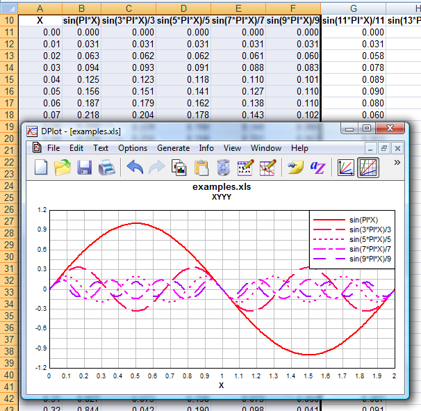
Similar to the XYXY command, but X is taken from the first selected column and all subsequently-selected columns are Y values for separate curves. If only one column is selected, it is assumed to be Y values and X is generated, starting at 0 and incremented by 1. Y columns may have blank cells.
If the X values for your data are not found in the leftmost column, you can use multiple selections to force the expected behavior: select the X data, then use the Ctrl key to append Y columns to the selection.
Your selection may include blank cells, which will be ignored.
If the data (including column headings, if any) you'd like to plot begins in row 1, you can select entire columns by clicking on the column headings (A, B, C, etc.).
Initial plot settings
Intially, XY plots produced by the Add-In will consist of line segments between each data point, with no symbols. You can easily switch to a scatter plot by:
1) |
Select Scatter Plot on the Options menu. For any curves that do not have a symbol selected, filled circles are used. Line type is set to "None". Or |
2) |
Right-click on a curve, select "Symbol style", then repeat for the "Line style", setting the style to "None". Repeat for all curves. |
If you are working with more than a couple of curves you may prefer to use the Symbol/Line Styles command on the Options menu.
Scaling (linear, logarithmic, polar, etc.)
Initially, XY plots generated by the Add-In will use linear scaling on both the X and Y axes. To change to a different format (logarithmic scaling, polar plot, etc.), right-click on the plot and select the scaling you'd prefer:
Example:

Page url:
https://www.dplot.com/help/index.htm?xyyycommand.htm