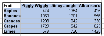
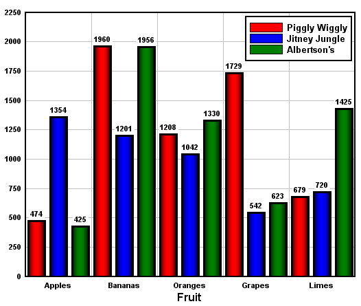
Creates a bar chart with non-numeric labels on the X axis with one or more groups of amplitudes. The X axis labels should be in the first column selected. Amplitudes should be in the second and subsequent columns. To select multiple non-adjacent columns, press the Ctrl key while making a selection.
If more than 10 labels are selected, the Add-In will instruct DPlot to orient the labels vertically. To change the label orientation within DPlot, select Options>Number Formats.
Example:


Initial plot settings
Intially the bar chart will have filled bars. If multiple data sets are graphed then the bars will be drawn side-by-side. You can quickly change bar chart settings (stacked bars, amplitude labels, bar width, etc.) within DPlot by right-clicking on the chart and selecting “Bar Chart Options”.
Page url:
https://www.dplot.com/help/index.htm?bar_chart_command.htm