|
|
Excel Add-In
Key Add-In features
- For most functions, you may use multiple selections if your data columns are not adjacent or if your data is otherwise not arranged as expected
(Y column preceding X, for example).
- Data is passed as floating point numbers and internally is independent of the formatting.
- Blank cells are interpreted as you'd expect (rather than filling with 0's, for example).
- Most functions attempt to use the same formatting in DPlot that is used in Excel (dates and/or times, for example).
Add-In Functions
XYXY
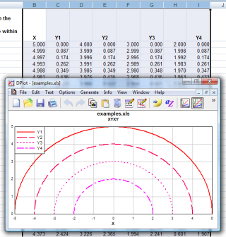
Select alternating X,Y columns and produce an XY plot. Column selections may have differing numbers of rows.
As with all XY plots produced by the Add-In, the plot will initially use linear scaling on both the X and Y axes and draw line segments between each
data point. To use a logarithmic or probability scale on either axis or to display the data as a bar chart, polar chart, or any of the other
graph types supported by DPlot, right-click on the graph and select the appropriate type. To change the line style,
symbol style, line width, symbol height, or color of any curve on the graph simply right-click on a graph to display a drop-down menu. Corresponding
commands for all of these options are on the Options menu in DPlot. |
 |
XYYY
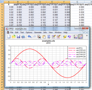
Same as above, but X is taken from the first selected column and all subsequently-selected columns are Y values for separate curves. If only one column is selected, it is assumed to be Y values and X is generated, starting at 0 and incremented by 1. Y columns may have blank cells. |
 |
X,Y,Label
Creates 1 curve on an XY plot with X taken from the first selected column, Y taken from the second selected column, and text labels in the third column. Label cells may be blank. |
 |
Bar chart
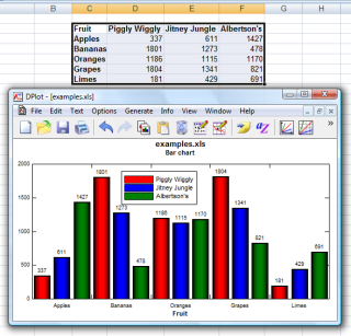
Creates a bar chart with non-numeric labels on the X axis and 1 or more groups of amplitudes.
In DPlot right-click on the plot and select Bar Chart Options to specify the fill style, width, spacing, orientation, and other characteristics
of the plot. See the Bar Chart page for more information. |
 |
Bar chart, data in rows
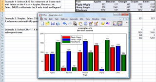
Same as Bar chart command, with data sets in the same row rather than the same column. |
 |
OneCurvePerRow
Similar to XYXY, but data is arranged by rows rather than columns, with alternating X and Y values in adjacent columns. Each row is used to produce one curve.
|
|
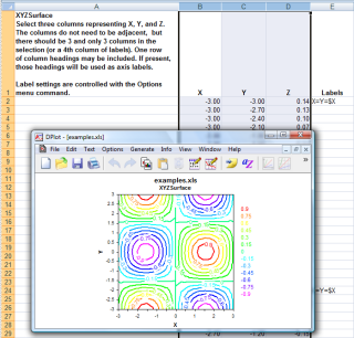
XYZSurface
Select an X, a Y, and a Z column (one or more selections). Produce a 3D surface plot.
The plot will initially be drawn in 2D with contour lines. To switch to a 3D view or use shaded color bands rather than contour lines, right-click on the plot
and select "Contour Options". |
 |
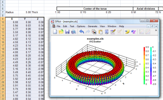
XYZScatter
Select one or more groups of X,Y,Z columns and produce a 3D scatter plot, one data set per X,Y,Z group. |
 |
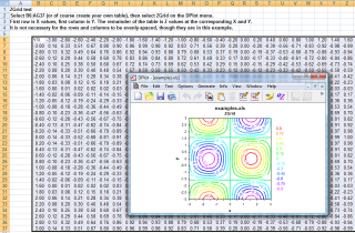
ZGrid
Select a table with X in the first row, Y in the first column, and the remainder of the table filled with Z values for the corresponding X and Y. Produces a 3D surface plot.
It is not necessary for X and Y to be evenly-spaced. |
 |
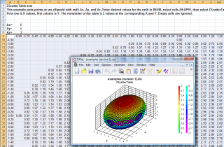
ZScatterTable
Very similar to ZGrid, but produces a scatter plot rather than a surface plot. (One consequence of this distinction is that you may have multiple points sharing the same X,Y coordinates.) Select a table with X in the first row, Y in the first column, and the remainder of the table filled with Z values for the corresponding X and Y. |
 |
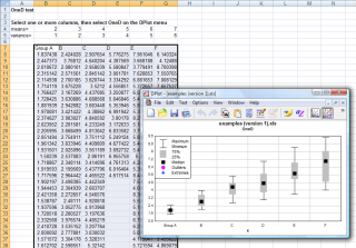
OneD
Select one or more columns of amplitudes and produce a box-and-whisker plot.
Switch to a dot graph by right-clicking on the plot and selecting "Dot Graph". Various plot parameters, e.g. the definitions of outliers and extremes, whether
the plot is mean- or median-based, etc., are accessible via the "Format" command on the right-click menu. |
 |
Add-In Installation
If you elect to install the optional Add-In during setup everything should proceed smoothly on Windows 95 or later and all versions of Excel
from Excel 97 through 2010. Your security settings may prevent the installation from being completed, but with a few short steps you should be able
to manually finish the installation. If you installed the Add-In but do not see a DPlot menu in Excel, see the
Using the DPlot Interface Add-In for Microsoft Excel topic in the online manual.
|
RUNS ON
Windows 7, 2008,
Vista, XP, NT,
ME, 2003, 2000,
Windows 98, 95
|
|