New "High-Low Curve" plugin

Beta releases, announcements and anything else that doesn't fit below. Please read the <B>Welcome</B> topic.
Post Reply
User avatar
DPlotAdmin
Posts: 2312
Joined: Tue Jun 24, 2003 9:34 pm
Location: Vicksburg, Mississippi
Contact:

New "High-Low Curve" plugin

Post by DPlotAdmin »

I'd appreciate any input any of you might have on a new plugin before it is released. If you're interested, download http://www.dplot.com/plugins/generate/hilo.dll and save to [dplot.exe folder]\plugins\generate. If you used the default installation path that will be c:\Program Files\DPlot\plugins\generate, or c:\Program Files (x86)\DPlot\plugins\generate on 64-bit versions of Windows. The next time you run DPlot you will see "High-Low Curve..." on the Generate menu.

This plugin creates a new document with Y values equal to the average Y for points that have the same X, along with Ymax-mean and mean-Ymin curves. The 2nd and 3rd curves are used as error bar extents. If there is only one point at a given X, then the "error" is 0 and no error bar is drawn.

Example input:
Image

results in:
Image

You can already do this same sort of thing with a dozen or so steps in DPlot, but if this interests you then you'll save a lot of time with the plugin.

Your comments, as always, are welcome.
Visualize Your Data
support@dplot.com
Ashi
Posts: 28
Joined: Sun Dec 30, 2007 11:49 pm

Add SEM!

Post by Ashi »

This is a great feature, I actually just had to do this today using MATLAB, only what I needed was SEM! It's very common for me to do exactly what you did only to use SEM as the error bars. And I bet I'm not the only one, so if you add that as an option, it'll be really useful!
User avatar
DPlotAdmin
Posts: 2312
Joined: Tue Jun 24, 2003 9:34 pm
Location: Vicksburg, Mississippi
Contact:

Post by DPlotAdmin »

Pardon my ignorance, but I'm pretty sure you aren't talking about search engine marketing or scanning electron microscopes. What's SEM?
Visualize Your Data
support@dplot.com
Ashi
Posts: 28
Joined: Sun Dec 30, 2007 11:49 pm

Post by Ashi »

Standard Error of the Mean :)

It's the Standard Deviation divided by the square root of the number of measurements. http://en.wikipedia.org/wiki/Standard_e ... tatistics)

You should probably also include the option of just the standard deviation since that's often used for the error in medical fields.

Or one of my personal favorites... the option to display both on the same graph! (the result is a wider set of error bars and a narrower set inside it). But that's going too far, just give us the options of SEM and sample SD and I'm sure people will be happy :)
Ashi
Posts: 28
Joined: Sun Dec 30, 2007 11:49 pm

Post by Ashi »

I think you should change the name of the feature to "Generate Averages Curve With Error Bars" or something like that, and then we can choose whichever kind of error bar we want with a clickthrough menu. This feature alone would justify people buying dplot at the new price! Of course, I bought dplot a few years ago, but I'll have a much easier time convincing others to buy it with this feature :)
Ashi
Posts: 28
Joined: Sun Dec 30, 2007 11:49 pm

Post by Ashi »

I would also recommend adding "Boxcar averaging at ___ X-precision" in the same menu as when we are choosing the error bar type, because sometimes repeated measurements have slightly different x values. In case you don't know what boxcar averaging is, at 0.1 precision it would mean averaging all values with x between 0.0 and 0.1, then with x between 0.1 and 0.2, then with x between 0.2 and 0.3, ...

And if all of this is added, then I insist that you feature this issue in the dplot tutorials and webpage! Because I predict a dramatic increase in dplot usership, since this procedure is such a routine (and usually painful) process in science labs.
User avatar
DPlotAdmin
Posts: 2312
Joined: Tue Jun 24, 2003 9:34 pm
Location: Vicksburg, Mississippi
Contact:

Post by DPlotAdmin »

Thanks for all of your input.
Visualize Your Data
support@dplot.com
User avatar
DPlotAdmin
Posts: 2312
Joined: Tue Jun 24, 2003 9:34 pm
Location: Vicksburg, Mississippi
Contact:

Post by DPlotAdmin »

I've updated the plugin. The link is still http://www.dplot.com/plugins/generate/hilo.dll. Again, save to the \plugins\generate folder below dplot.exe. This time the plugin will show as "Average Curve with Error Bars" on the Generate menu. We may end up tussling over this as some folks tend to argue about the definition of standard deviation, but in this case it is consistent with the usage elsewhere in DPlot: st. dev. = sqrt( sum((Yi-mean)^2)/(N-1) ), where N is the number of points at the given X, Yi is the amplitude for 1-N points that have the same X, and mean of course is the average value for those N Yi's. Standard error is <standard deviation>/N. (For only one point the standard deviation and standard error are both 0.)

I'm reasonably sure I've done this correctly but if you try either "standard error" or "standard deviation" and get results you don't agree with, of course please let me know (with example data).

I haven't yet incorporated your "gather all points with a <= x <= b" thing but most likely will, with the default interval being 0. If you aren't aware of it you can do this now before using this plugin with Edit>Operate on X and either X=MROUND(X,<multiple>) or X=ROUND(X,<num_digits>). I'll most likely opt for something like MROUND once this is done.
And if all of this is added, then I insist that you feature this issue in the dplot tutorials and webpage!
Point taken, thanks. That's the main reason for adding a Help button, which currently brings up a not-especially-helpful Help screen with DPlot's Help file for the Generate menu but will of course be improved in the next release.
Visualize Your Data
support@dplot.com
User avatar
DPlotAdmin
Posts: 2312
Joined: Tue Jun 24, 2003 9:34 pm
Location: Vicksburg, Mississippi
Contact:

Post by DPlotAdmin »

I can probably justifiably be accused of being hyperactive here, but that's OK. The NEW plugin (same link as before) includes a "Group X values within interval:" entry. This rounds all input X values to the closest <interval> (or leaves them alone for interval=0).
Visualize Your Data
support@dplot.com
User avatar
DPlotAdmin
Posts: 2312
Joined: Tue Jun 24, 2003 9:34 pm
Location: Vicksburg, Mississippi
Contact:

Post by DPlotAdmin »

Whoops! The last update calculated standard error as standard deviation divided by the number of points, rather than standard deviation divided by the square root of the number of points. This one is fixed:
http://www.dplot.com/plugins/generate/hilo.dll
Visualize Your Data
support@dplot.com
Ashi
Posts: 28
Joined: Sun Dec 30, 2007 11:49 pm

Post by Ashi »

I can probably justifiably be accused of being hyperactive here...
No complaints about that here :)
Whoops! The last update calculated standard error as standard deviation divided by the number of points, rather than standard deviation divided by the square root of the number of points.
I was just about to point that out :)
And if all of this is added, then I insist that you feature this issue in the dplot tutorials and webpage!
I only insist on this from a marketing perspective, not because I think the feature is complicated to use :) I think it should be part of the standard installation and that should be shown high up on the below page for example (with as a two part image, before generate and after generate, like in this post):

http://www.dplot.com/features.htm

Sorry for not replying sooner, I just thought it'd take you a few days before you got the box-carring in :)
User avatar
DPlotAdmin
Posts: 2312
Joined: Tue Jun 24, 2003 9:34 pm
Location: Vicksburg, Mississippi
Contact:

Post by DPlotAdmin »

Thanks for the reply.
I only insist on this from a marketing perspective, not because I think the feature is complicated to use I think it should be part of the standard installation and that should be shown high up on the below page for example (with as a two part image, before generate and after generate...
I think it is probably useful enough that it should be included in the trial version and given prominence on the Features page. Weirdly (to me, at least) moving the 3D stuff and background images up several months ago resulted in more sales, so this sort of thing does actually occur to me every now and then. On the other hand, if I take this to its logical extreme the Excel Add-In will be the first thing mentioned on every single page... which doesn't seem quite right, somehow :D. In any case, your point is taken. I think a lot of people might like this, even though the operations were previously possible with (admittedly many) more steps.
Sorry for not replying sooner, I just thought it'd take you a few days before you got the box-carring in.
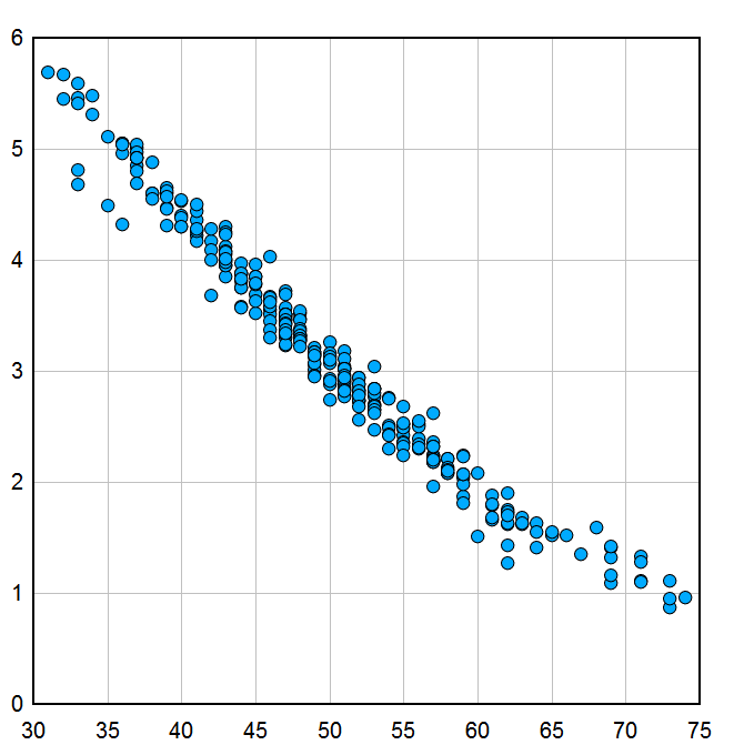
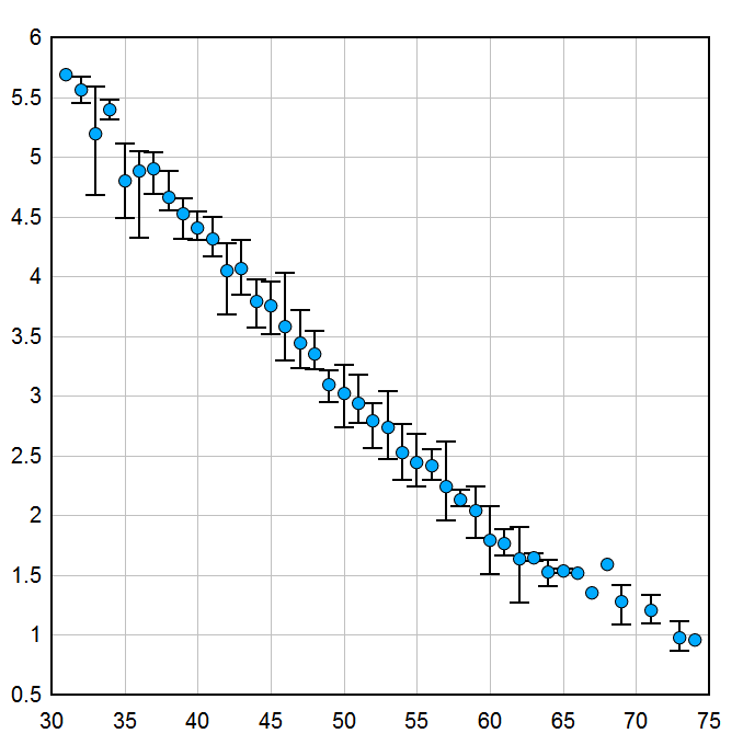
No reason to be sorry - I sent e-mail only because I genuinely wasn't sure how the "Topic Reply Notification" gizmo worked (and truthfully, I'm still not sure even though I've had this forum for 8 years). As for boxcar stuff - I've looked around and as far as I can tell the term refers to averaging over N points, not necessarily a fixed interval in X. With a constant spacing in X the two are roughly equivalent, but to me what I'm doing now makes more sense. If for some reason that hasn't occurred to me you think averaging over N points rather than an interval in X would be useful, please say so. It is a fairly easy change if you think it would be useful.
Visualize Your Data
support@dplot.com
Ashi
Posts: 28
Joined: Sun Dec 30, 2007 11:49 pm

Post by Ashi »

I actually don't remember how the forum works either :) I think it's any post on the topic but I'm not sure.

I completely agree that over x intervals is the way to go, regardless of what boxcar-ing actually means. I think you should call it "average x values..." rather than "group x values..." but I"m not sure what would be less confusing. Maybe just "in intervals of ___" with no mention of a verb! One thing to consider adding is "starting at ___", because we might want the intervals that don't start at 0. E.g., intervals of one but starting a 1.5, or intervals of 20 starting at 170 (170, 190, 210).

I was pleasantly surprised that it operated over multiple curves at the same time! Awesome!!!

Using these new powers and Equal intervals combined... I will rule the world! (... I mean we will rule the world!)
User avatar
DPlotAdmin
Posts: 2312
Joined: Tue Jun 24, 2003 9:34 pm
Location: Vicksburg, Mississippi
Contact:

Post by DPlotAdmin »

One more, again at http://www.dplot.com/plugins/generate/hilo.dll.

I don't think "average x values" is right, because nothing is really being averaged here - at least not X. Having said that, the new label "Start at X=" entry isn't strictly correct either, because (using your example) the output might be at X=-2.5,-1.5,-0.5,0.5, etc. But I can probably live with this one.

I'm not really all that interested in ruling the world, so I'll go ahead and cede my rights to you in advance of when the moment comes :-)
Visualize Your Data
support@dplot.com
Ashi
Posts: 28
Joined: Sun Dec 30, 2007 11:49 pm

Post by Ashi »

DPlotAdmin wrote:I don't think "average x values" is right, because nothing is really being averaged here - at least not X.
Good point!
DPlotAdmin wrote:... the new label "Start at X=" entry isn't strictly correct either...
That depends on the user's input relative to their data set. :)
DPlotAdmin wrote:I'm not really all that interested in ruling the world, so I'll go ahead and cede my rights to you in advance of when the moment comes :-)
Thank you for your loyalty, in advance :)
User avatar
DPlotAdmin
Posts: 2312
Joined: Tue Jun 24, 2003 9:34 pm
Location: Vicksburg, Mississippi
Contact:

Post by DPlotAdmin »

Done, though you already have everything you need aside from the Help topic. Thanks for all of your input on this. If you have a good example you wouldn't mind sharing with the world, send along the DPlot file and I'll put it in the blog. (Everything I've come up with has been pretty obviously a simple function with some randomness added - a real world example would be better.)
Visualize Your Data
support@dplot.com
Ashi
Posts: 28
Joined: Sun Dec 30, 2007 11:49 pm

Post by Ashi »

I didn't have anything handy, but this is such a great feature that I took the time to put something together for you :) Emailed!
User avatar
DPlotAdmin
Posts: 2312
Joined: Tue Jun 24, 2003 9:34 pm
Location: Vicksburg, Mississippi
Contact:

Post by DPlotAdmin »

Thanks!
Visualize Your Data
support@dplot.com
Post Reply