| View previous topic :: View next topic |
| Author |
Message |
jsc
Joined: 02 Dec 2005
Posts: 222
|
 Posted: Thu Nov 13, 2008 4:48 pm Post subject: GPS Location Data with Speeds Posted: Thu Nov 13, 2008 4:48 pm Post subject: GPS Location Data with Speeds |
 |
|
David,
Not sure how to do this, but seems possible in current versions of DPlot.
I have Longitude, Latitude, and Speed as XYY column data. It seems that I should be able to have speed indicated by color range or bubble size at each GPS location. I can eventually get something than looks close from XYZScatter or from Bubble Plot in 2D, but DPlot doesn't really consider what I have plotted as a map because of the third column and its range of values.
It's probably right under my nose - can I do this? |
|
| Back to top |
|
 |
DPlotAdmin
Site Admin

Joined: 24 Jun 2003
Posts: 2310
Location: Vicksburg, Mississippi
|
| Posted: Fri Nov 14, 2008 1:24 pm Post subject: |
|
|
Jon,
If I understand your question, just right-click on the plot and select "Mercator Projection".
_________________
Visualize Your Data
support@dplot.com |
|
| Back to top |
|
|
jsc
Joined: 02 Dec 2005
Posts: 222
|
| Posted: Fri Nov 14, 2008 2:00 pm Post subject: |
|
|
I tried again with reorganized data. Originally had columns in Latitude, Longitude, Speed order, and then swapped X<>Y for the Lat<>Long, but DPLot didn't seem to understand (rephrase that - I didn't understand!) what was being swapped.
If set up the data correctly, the bubble plot command works correctly. I just didn't seem to have the right combination yesterday.
Looks like best bet is to set up all map and trip first, then copy and paste directly to dplot a single column of speed data, then go for the Bubble command.
Thanks! |
|
| Back to top |
|
|
DPlotAdmin
Site Admin
Joined: 24 Jun 2003
Posts: 2310
Location: Vicksburg, Mississippi
|
| Posted: Fri Nov 14, 2008 3:50 pm Post subject: |
|
|
Reading a file with Latitude, Longitude, Speed w/o using "Pick columns to plot" - Swap X,Y should still work OK (Latitude swapped with Longitude) as long as you don't then sort the points. That's true because the Speed magnitudes in your bubble plot won't be tied to a specific X (Longitude after Swap X,Y). But if you DO sort the values after Swap X,Y then there's no way to get there from here. I would think, though, that everything should be fairly straightforward if you use "Pick columns to plot" and assign column 2 (longitude) to X and columns 1 and 3 (latitude and speed) to Y.
_________________
Visualize Your Data
support@dplot.com |
|
| Back to top |
|
|
jsc
Joined: 02 Dec 2005
Posts: 222
|
| Posted: Fri Nov 14, 2008 5:29 pm Post subject: |
|
|
If I have a map with several curves in it, then paste in the speed data as a single column, then select the bubble plot function and match the correct gps route with the speed data, it doesn't seem like DPlot aligns the "trip curve" with the magnitude data properly. When I plot the trip and speed data in a separate document, the magnitude range looks different than when it's in the larger plot.
This must be a resolution issue? (I bet this is pushing DPlot to the limits here! And I'm _not_ asking for more resolution!!!)
I also sent you an overlay plot that you might be interested in. (If only I can duplicate my steps - was by accident!) |
|
| Back to top |
|
|
DPlotAdmin
Site Admin
Joined: 24 Jun 2003
Posts: 2310
Location: Vicksburg, Mississippi
|
| Posted: Fri Nov 14, 2008 11:02 pm Post subject: |
|
|
Jon,
| Quote: | | If I have a map with several curves in it, then paste in the speed data as a single column, then select the bubble plot function and match the correct gps route with the speed data, it doesn't seem like DPlot aligns the "trip curve" with the magnitude data properly. When I plot the trip and speed data in a separate document, the magnitude range looks different than when it's in the larger plot. |
I'm not sure I completely follow this, but it may be that you misunderstand how bubble plots (and vector plots and error bars with "Different error values for every point" all work, which is the same in each case: the X values for the bubble magnitudes, vector magnitudes and angles, and error values are irrelevant. The 1st point from the bubble magnitude "curve" is matched up with the first point in "Which curve?" curve; the 236th point in the bubble magnitude curve is matched up with the 236th point in the "Which curve?" curve. Unless you do something to reorder points (Sort, for example) then it shouldn't matter whether all of the data is read in at once or if you read your lat-lon data, then paste in speed data. I've of course been wrong before. If you can provide a couple of example files that illustrate how this doesn't work as expected, I'd be appreciative.
| Quote: | | I also sent you an overlay plot that you might be interested in. (If only I can duplicate my steps - was by accident!) |
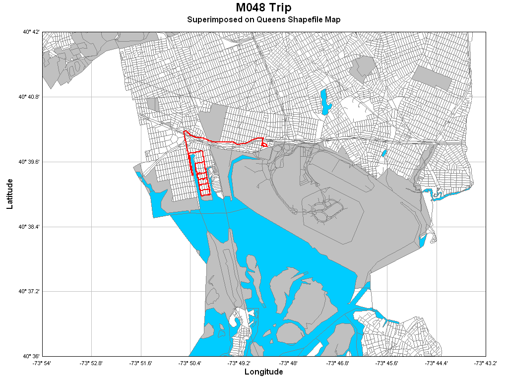
Received... or at least I think I did, and replied to. (If you didn't get the reply then I'm apparently still having e-mail problems that I thought were all worked out.) In any case - I hope you don't mind, but the plot is repeated below just because it's pretty darn snazzy and I think it might give others ideas about what they can do with maps in DPlot.
_________________
Visualize Your Data
support@dplot.com |
|
| Back to top |
|
|
|
|
You cannot post new topics in this forum
You cannot reply to topics in this forum
You cannot edit your posts in this forum
You cannot delete your posts in this forum
You cannot vote in polls in this forum
|
Powered by phpBB © 2001, 2005 phpBB Group
|

