| View previous topic :: View next topic |
| Author |
Message |
kcl
Joined: 10 Jan 2004
Posts: 2
|
 Posted: Sat Jan 10, 2004 11:59 am Post subject: New user question-fill Posted: Sat Jan 10, 2004 11:59 am Post subject: New user question-fill |
 |
|
I would like to fill from one curve to the bottom of the graph. The only way I have been able to do this is to enter a new curve with a zero value for the x axis and fill between them. Is there an easier way to do this?
Thanks
Keith |
|
| Back to top |
|
 |
DPlotAdmin
Site Admin

Joined: 24 Jun 2003
Posts: 2310
Location: Vicksburg, Mississippi
|
| Posted: Sat Jan 10, 2004 5:43 pm Post subject: |
|
|
Keith,
No, that's how I'd do it as well. In addition you'll probably want to use "None" for the line style and symbol style for your Y=0 curve.
_________________
Visualize Your Data
support@dplot.com |
|
| Back to top |
|
|
DPlotAdmin
Site Admin
Joined: 24 Jun 2003
Posts: 2310
Location: Vicksburg, Mississippi
|
|
| Back to top |
|
|
jgmiles
Joined: 19 Dec 2003
Posts: 14
Location: Salt Lake City, Utah
|
| Posted: Sun Jan 11, 2004 7:06 pm Post subject: Additional fill options |
|
|
David,
I was actually going to make a similar suggestion; however, my need is generally for when I am plotting around a mid-line zero x-axis. I also used the y=0 workaround, but would always have to rehide the y=0 "graph" on reopening the file. Is it possible to include the fill option for a mid-line axis rather than only the bottom x-axis?
I have an additional & related request. Is it possible to use one color for fills >0 and another for fills <0. The reason for this is that we are almost always plotting anomalies (rather than absolutes) about a particular standard reference (e.g., temperature anomalies about a long term climatic temperature).
Additionally, many, if not most, of our indices used in describing atmospheric conditions are normalized between -1 and +1 (e.g., there is an index that describes the El Nino/La Nina state of the Pacific ocean, another describing the "North Atlantic Oscillation," etc.).
The obvious reason for the different colors is to visually indicate when the condition that the index measures (e.g., atmospheric/oceanic conditions important to forecasting) has transitioned from one state to another. This is also especially useful when denoting periods of warm anomalies vs. cold ones. Even the "El Nino" (warm ocean surface temps) vs "La Nina" (cold ocean upwellings) index fits nicely into a color scheme where red is warm/blue is cool.
I could send you some sample graphs separately, but I think you get the idea. They are ubiquitous in my particular field. I'd use a work around, but I haven't yet discovered any.
Just thought I'd bring it up since your mind is already on the subject (I know, just what you wanted  ). ).
--John
P.S. Almost forgot--it would also be nice to be able to display the mid-line axis information/tick marks above the fill. Currently the requisite axis data are hidden under the fill and are hard to follow, especially since I use the mid-line 0-axis only in most of these situations. The lower x-axis becomes more clutter than useful in these particular graphs. |
|
| Back to top |
|
|
kcl
Joined: 10 Jan 2004
Posts: 2
|
| Posted: Sun Jan 11, 2004 9:09 pm Post subject: |
|
|
Thanks for providing this option so fast.
Keith |
|
| Back to top |
|
|
DPlotAdmin
Site Admin
Joined: 24 Jun 2003
Posts: 2310
Location: Vicksburg, Mississippi
|
| Posted: Sun Jan 11, 2004 11:02 pm Post subject: |
|
|
Keith,
No problem, and thanks again for the suggestion.
John,
| Quote: | | I was actually going to make a similar suggestion; however, my need is generally for when I am plotting around a mid-line zero x-axis. I also used the y=0 workaround, but would always have to rehide the y=0 "graph" on reopening the file. |
My guess is you're using View>Hide all curves but..., which gets turned off when you reread the file. You can get the same (but persistent) effect by setting the line style and symbol style to "None"
| Quote: | | Is it possible to include the fill option for a mid-line axis rather than only the bottom x-axis? |
Sure, I'll add an option for "Y=", not limited to Y=0.
| Quote: | | I have an additional & related request. Is it possible to use one color for fills >0 and another for fills <0. The reason for this is that we are almost always plotting anomalies (rather than absolutes) about a particular standard reference (e.g., temperature anomalies about a long term climatic temperature). |
That's just slightly more trouble but also doable. Look for it next time.
| Quote: | | I could send you some sample graphs separately, but I think you get the idea. They are ubiquitous in my particular field. I'd use a work around, but I haven't yet discovered any. |
The only workaround I can think of off the top of my head would be way too much trouble - make a duplicate of your curve. In one curve delete all points above your reference line, in the other delete all points below the reference line, and if necessary add interpolated points where your data crosses the reference line. But don't do this - it will take less time to add the feature than it would to manipulate your data like that.
| Quote: | | P.S. Almost forgot--it would also be nice to be able to display the mid-line axis information/tick marks above the fill. Currently the requisite axis data are hidden under the fill and are hard to follow, especially since I use the mid-line 0-axis only in most of these situations. The lower x-axis becomes more clutter than useful in these particular graphs. |
Don't use a solid fill  . I'll add an option to draw the fills before the grid lines (if you're talking about anything other than grid lines/tick marks you've lost me). Oooh... partially transparent fills would be cool, wouldn't they? . I'll add an option to draw the fills before the grid lines (if you're talking about anything other than grid lines/tick marks you've lost me). Oooh... partially transparent fills would be cool, wouldn't they?
_________________
Visualize Your Data
support@dplot.com |
|
| Back to top |
|
|
jgmiles
Joined: 19 Dec 2003
Posts: 14
Location: Salt Lake City, Utah
|
| Posted: Tue Jan 13, 2004 1:21 am Post subject: |
|
|
As always, I appreciate your efforts on all this.
| Quote: | | I'll add an option to draw the fills before the grid lines (if you're talking about anything other than grid lines/tick marks you've lost me). |
I was thinking of the tick labels as well as the the midline x-axis & ticks (the y=0 line). I really wasn't thinking about grid lines since it was only when the "No grid lines" option was chosen that the labels & ticks themselves became important--the lower axis & associated tick labels would then, of course, disappear.
Even when using a hatch or cross-hatch pattern, the tick labels (years, for example) under the hatches are a bit difficult to read (especially at smaller relative font sizes on a high resolution screen, when a graph is resized as a wmf, etc.).
--John |
|
| Back to top |
|
|
DPlotAdmin
Site Admin
Joined: 24 Jun 2003
Posts: 2310
Location: Vicksburg, Mississippi
|
| Posted: Tue Jan 13, 2004 2:09 am Post subject: |
|
|
Ah... I hadn't thought of the "Axes at 0" option. So you want something like:
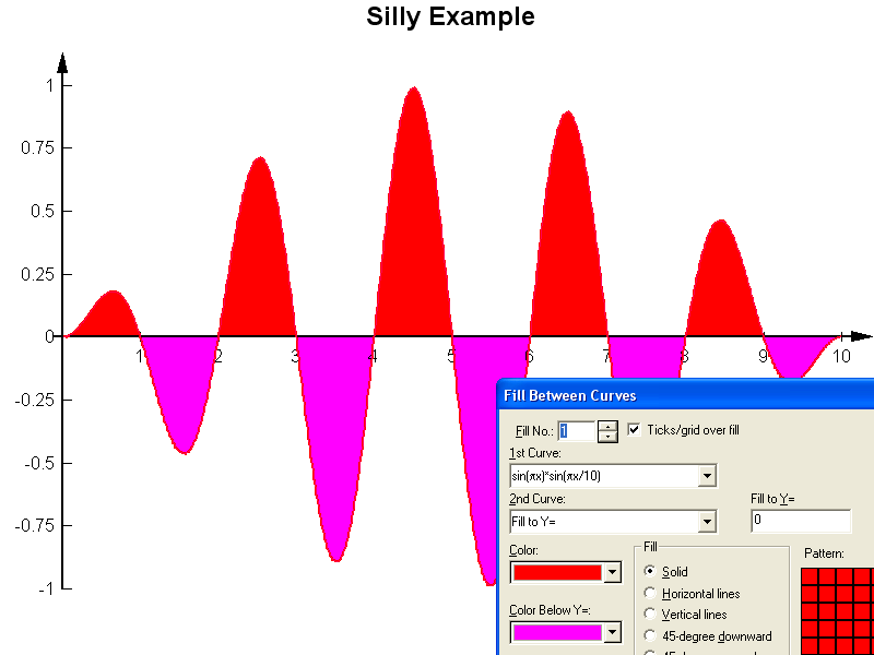
... except that I didn't think this through as well as I should have. The fill patterns are "under" the tick marks and axis, but the curve itself isn't. I need to move this option and make it more general - fill patterns/curves under the grid/tick marks.
_________________
Visualize Your Data
support@dplot.com |
|
| Back to top |
|
|
DPlotAdmin
Site Admin
Joined: 24 Jun 2003
Posts: 2310
Location: Vicksburg, Mississippi
|
| Posted: Tue Jan 13, 2004 2:49 am Post subject: |
|
|
But on second thought... this is probably just a personal preference, but grid lines overlaying the curves/fill patterns just doesn't look good to me. On the other hand, the tick marks and labels used when "Axes at 0" is checked should never be overwritten. So no new option is needed, just a non-optional change in drawing order. And that's done: New beta is uploaded, same restrictions apply (licensed users should be running v1.9 or later). Get it from http://www.dplot.com/beta/dplotsetup.exe
_________________
Visualize Your Data
support@dplot.com |
|
| Back to top |
|
|
jgmiles
Joined: 19 Dec 2003
Posts: 14
Location: Salt Lake City, Utah
|
| Posted: Wed Jan 14, 2004 2:28 am Post subject: |
|
|
Love it. Just what the doctor ordered.
--John |
|
| Back to top |
|
|
jgmiles
Joined: 19 Dec 2003
Posts: 14
Location: Salt Lake City, Utah
|
| Posted: Sat Jan 31, 2004 10:57 pm Post subject: |
|
|
David,
A few last improvements that I'd like you to consider for fills & number formatting. Would it be possible to extend the same color fill options (for above and below the selected y=a line [y=0 in my case is the norm]) to the bar charts as well?
Also, I'd like to be able to include a legend entry for each of the different fill colors (e.g., La Nino > 0 color versus El Nino < 0 color)?
Finally, it would be nice to have a number formatting option that allows me to fix the number of decimal places (and the presence of the leading 0 before the decimal--e.g., .149786 becomes, optionally, 0.15 or .15 when I fix the decimal places to two (2)). A similar option is especially needed when trying to display the "amplitude labels" at the top of bar chart bars--too many decimal places and overlapping values look very messy. Perhaps the ability to specifiy amplitude label intervals would also help here.
--John Miles |
|
| Back to top |
|
|
DPlotAdmin
Site Admin
Joined: 24 Jun 2003
Posts: 2310
Location: Vicksburg, Mississippi
|
| Posted: Sun Feb 01, 2004 12:24 am Post subject: |
|
|
| Quote: | | A few last improvements that I'd like you to consider for fills & number formatting. Would it be possible to extend the same color fill options (for above and below the selected y=a line [y=0 in my case is the norm]) to the bar charts as well? |
This might be a little confusing on bar charts with multiple data sets, but I'll give it a go. There's also been a request to add the ability to use various fill patterns on bars rather than solid colors, primarily for B&W output.
| Quote: | | Also, I'd like to be able to include a legend entry for each of the different fill colors (e.g., La Nino > 0 color versus El Nino < 0 color)? |
OK
| Quote: | | Finally, it would be nice to have a number formatting option that allows me to fix the number of decimal places (and the presence of the leading 0 before the decimal--e.g., .149786 becomes, optionally, 0.15 or .15 when I fix the decimal places to two (2)). A similar option is especially needed when trying to display the "amplitude labels" at the top of bar chart bars--too many decimal places and overlapping values look very messy. Perhaps the ability to specifiy amplitude label intervals would also help here. |
Specifying precision has been on my to-do list for a while, but always seems to get pushed back in favor of whizbang options. I'll try to add this in the next release.
_________________
Visualize Your Data
support@dplot.com |
|
| Back to top |
|
|
|
|
You cannot post new topics in this forum
You cannot reply to topics in this forum
You cannot edit your posts in this forum
You cannot delete your posts in this forum
You cannot vote in polls in this forum
|
Powered by phpBB © 2001, 2005 phpBB Group
|

